
No audio available for this content.
Birth of an epidemic

Men wearing white bio-suits entered the market from the main entrance. A panic ensued at the sight, and a commotion quickly spread through the crowd.
Shop keepers, sensing the worst, hurriedly gathered their belongings. People rushed towards the exits. More armed soldiers in white bio-suits pressed in, sealing off escape. Screams and weeping filled the market with the din of anxiety and fear. The Huanan Seafood Market was under lock down. The order was not to hurt anyone, but no one was to leave. The quarantine had begun.
Empty semi-trucks lined the main road. The trucks entered the parking lot one by one, and masked soldiers guided people into the backs of the empty trucks. Once filled, the trucks drove away until the market was empty. The people were transported to “isolation centers” several hundred kilometers outside the city.

In Wuhan, the situation had deteriorated rapidly. A month earlier videos went viral about a mysterious flu with pneumonia-like symptoms. Most of the information was coming from citizen journalists. People speculated the Huanan Seafood Market was the source of the illness, but no official statements had been made.
Anxiety spread. People began fleeing Wuhan ahead of the Chinese New Year, which is the world’s largest annual human migration. Making matters worse, Wuhan is a major transportation hub in Central China, servicing 400,000 commuters per day through the Hankou Railway Station, a short, 15-minute walk to the Huanan Seafood Market.
Alerting the world
On Dec. 31, 2019, China notified the World Health Organization (WHO) of the infection. The cause was a new strain of coronavirus along the same viral spectrum as the severe acute respiratory syndrome (SARS) and the Middle East respiratory syndrome (MERS). The next morning, on Wednesday, Jan. 1, 2020, the WHO declared the novel coronavirus 2019 (COVID-19) a public health emergency. It was also that morning that the seafood market was shutdown.
Above: One of the first and only videos coming out of China that covers the outbreak. Copyright: DW News, posted 23-JAN-2020
Twenty-three days after China notified the WHO, the city of Wuhan and the entire province of Hubei were quarantined and cut off from the rest of the world — an area comprising 57 million people, unprecedented in the history of public health.
Still, even with such extraordinary measures, it was already too late. The people moved faster than the system could adjust. Five million people, almost half the residents of Wuhan, had already evacuated. Many traveled to other parts of China to stay with family while others left China altogether, some finding themselves in countries they were banned from entering.
Containment and quarantine
China is now dealing with a containment issue at some level in every one of its provinces. In total, 174 million people in China are under some level of travel restriction. By comparison, that is equal to more than half the population of the United States.
China immediately began leaning on its massive surveillance network and facial recognition technologies to control the outbreak. Using these technologies, Chinese authorities could narrow the search for those most likely to carry the virus. The situation transitioned from a medical emergency to a national security emergency on Tuesday, Feb. 11, when China fired its two highest ranking medical officials in Hubei province, replacing them with a senior Chinese government party official.
Additionally, China continues working with the three cellular phone carriers in the country to gain access to users’ location data. This information will enable China to conduct geospatial analysis at an individual scale to identify those who have come into contact with infected areas. This practice is very controversial, placing privacy and human rights in conflict with public health security.
Roots of GIS in epidemiology
Epidemiology is the study of people, place and disease, perfectly suited for geospatial technologies. Not surprisingly then, the true origins of geographic information systems (GIS) are founded in epidemiology, harkening back to John Snow’s Cholera map in 1854. The location of infected people clearly pointed to the Broad Street water pump as the cause. That changed the scientific understanding of the time from believing cholera was transmitted in the air to realizing it was a waterborne disease.

Similarly, the scientific consensus of COVID-19 has also changed since it first emerged. When the outbreak began, it was believed to be zoonotic, meaning the virus originated from animals and transmitted to humans. It was then believed the virus could only be transmitted directly from person to person. Now, it is known to be carried through the air or by touching infected surfaces.
Each of these modes changes the transmission rate of the disease. This is known as the reproduction number, written as R0 and referred to as the R-naught number. The larger the R-naught, the more infectious the disease. COVID-19 is estimated to have an R-naught between 1.4 and 6.6, which is similar to its cousin the SARS virus; however, SARS only infected 8,096 people and this virus is already more than 10 times that amount.
In terms of GIS, the higher the R0, the greater the geographic area potentially infected. Narrowing the area to concentrate resources more efficiently requires improved modeling and collecting more data, both of which increase the time required before effective measures can be taken. This creates a dilemma between acting swiftly and acting accurately. This explains some of the images coming out of China showing people forcibly removed from their homes and placed in quarantine.

Controlling the spread of the virus also requires knowing the source of each outbreak. The originating source, called the reservoir, once discovered can be cordoned off. Afterwards, through a process called “contact tracing,” all potentially infected people are tracked down and monitored or quarantined if necessary.
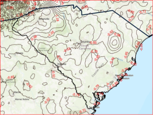
Probability models based on geospatial analysis use factors such as age, sex, pre-existing health conditions and distance from the reservoir overlaid with data such as population density to create an intensity map showing the areas most favorable to the spread of infection. People in the defined areas can be isolated and monitored, preempting further spread.

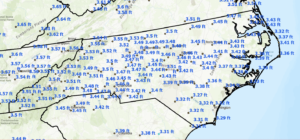
In the United States, the Health Insurance Portability and Accountability Act (HIPPA) requires data be aggregated at the zip code or county level, which is useful in defining regional trends, such as the CDC maps above of heart disease (red) and the areas of least physical activity (teal). Comparing the two visualizes the premise that exercise and good health go together. However, at this scale the information is not useful in fighting a dynamic and evolving situation like an infectious outbreak.
Ultimately, the goal is real-time feedback at a high-scale resolution. Smartphones and other mobile devices offer unique opportunities to combat epidemics. South Korea is using location information to help contain the outbreak. People use a special number to text where they have traveled. This is to assist in contact tracing if necessary.
Mobile devices can also report location data along with vital signs to monitor overall health and instantly identify individuals who may be a risk. The mobile device can also alert individuals if they are nearing an infected area and show the infected zones on their phones.
COVID-19 reporting via GIS
Systems can be established to report live events like Waze does for reporting traffic hazards, which have proven to report accidents faster than 911 calls. Also, the use of social media live feeds can help identify evolving situations and monitor existing ones.
Perhaps the government, working with mobile application mapping companies, should create a layer specifically for the epidemic that provides critical information, such as healthcare centers, some of which might be established specifically for the care of the disease outbreak.
Also, included in that public health layer would be high-risk areas, prohibited entry locations, areas under quarantine, and more, in order to provide an integrated interface to communicate with the general public. This is similar to how the departments of transportation, public works, and emergency response units provide information to the public to reroute traffic around congestion, accidents or closed-off areas.

A former U.S. Navy healthcare executive, Ben Boccuzzi, Ph.D., shared his thoughts on the matter with me. “The actual mortality rate of COVID-19 (in the U.S.) is hard to determine until mass testing can be done,” Boccuzzi said. “As of now, the true denominator (all people that would test positive for the virus) we only know of symptomatically and those that died from the disease. So, with these small numbers, the real mortality rate is not fully known. When testing begins on a grander scale, and more people are known to have the virus and do well, the actual rate of mortality will become much smaller.”
It is now more than two full months since the WHO declared a public health emergency. The number of known cases worldwide stands at 105,941 with 3,569 deaths affecting 100 countries.
If you’d like to track the virus, the John Hopkins GIS webmap interface updates in real time as new information becomes available.
Story Maps
Working with the University of Potomac, several students contributed story maps for this article. You can see their full projects at the links below:

If you have read this far, thank you. I would like to leave you with the most important information in this article.
When I began covering this story it was early January, the virus was just beginning to make the news. Fear was in the air. I began to worry. As I immersed myself deeper into the topic, I became even more concerned; so much so, I bought two months of supplies preparing for a long-term self-quarantine situation.
If you’ve been watching the news, you may be nearing the same state of mind I found myself in. If so, I’ve got good news for you.
Paradoxically, people are attracted to fear. Fear is a potent biochemical rush. The horror movie industry rakes in $11.7 billion per year. Most media’s primary business is not information. It is using information to increase its readers and viewers, and fear captures people and holds their attention. The media is a profit-driven business. Facts tell. Fear sells.
The following is what is reported by the WHO based on 55,924 laboratory-confirmed cases since the coronavirus began. The study was published on Feb. 28. At that time, there were 86,992 confirmed cases of COVID-19 and 2,979 deaths, equating to a mortality rate of 3.4%, but those numbers were mostly in China, specifically Hubei province. Outside of China, the number of cases were only 7,166 with 109 deaths having a fatality rate of 1.5%.

These numbers do not reflect the whole story. If you are below age 50 and in good health, recovery is 99.1%, so there is almost no reason to be concerned. For those older than age 50 the mortality rate is 1.3%, and over age 60 it increases to 3.6%. For those over age 70 it doubles to 8.0%. The most vulnerable populations are those over age 80 with a mortality rate of 14.8%.
Additionally, those with pre-existing conditions, such as cardiovascular disease, diabetes, or respiratory disease are also at high risk. If you fall into either of those categories, take great care with your hygiene and personal protection. However, if you are below 60 and in moderately good health, there is less than a 1.3% reason to be concerned and more than 98.7% reason not to be concerned.
Unless something significant changes, the virus is a reason for caution, but should not be a cause for panic. The fearmongering has gotten out of control. We may or may not get COVID-19, but for those of us who do, most of us will only experience muscle aches, fever and a dry cough, about the same as catching a bad cold.
Ironically, be grateful in times like these. They give us reasons to take pause, love our family, appreciate what we have, realize life is worth living, and get our house in order. The truth is not the story we are being sold.


Jack
Great article. Thanks. The Snow work is classic. Recent polio work in Africa, ebola, and the Ordnance Survey work on hoof & mouth are also great examples of GIS being used to slow and contain bio outbreaks. You can’t treat something if you dont know where it is. Testing and location data are absolutely critical steps to contain the COVID outbreak. Geo-epidemiology is a little known, specialized field that hopefully will grow.
William Tewelow
Jack,
All of those you mentioned are great examples. I would surely have used them if writing a longer article. Geo-epidemiology is the being brought to the forefront because of this crisis. I expect there will be innovations and more exploration into the field. Geo-epidemiology will play a first-responder type role when the next health crisis hits.