No audio available for this content.

Esri has released a new mapping app, Air Quality Aware, that fuses data from the EPA’s AirNow program, NOAA’s National Weather Service wind forecast and the American Community Survey to provide location intelligence on current air quality and its impacts on local communities.
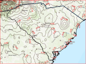
At a national level, areas are color-coded according to EPA’s Air Quality Index, with magenta and purple representing hazardous and very unhealthy air quality.
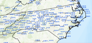
As users zoom in, the map shows the air-quality scores reported at each individual air-quality monitoring station.
Users can click on any station for more information about the pollutants and concentrations reported at that location. They can also search for or click any place on the map to get more information about current and forecasts of air quality, wind speed and insights about the vulnerable population in each place.


Daryl V. Gottschalk
Nice program , want the app Please