No audio available for this content.
Editor’s Note: The following is a blog post from a Humboldt State University Geography Lecturer Monica Stephens describing her students’ (Amelia Egle, Miles Ross, Matthew Eiben) tweet mapping project. While mapping Twitter content for disaster response is becoming commonplace, mapping cultural values is not. It’s a fascinating example of using GIS to map specific Twitter content.
—————————————————————————————————————————————————-
The Geography of Hate
UPDATE (5/13/13 @ 10:45pm): We have written and published a FAQ to respond to some of the questions and concerns raised in the comments here and elsewhere. Please review our comments there before commenting or emailing.Following the 2012 US Presidential election, we created a map of tweets that referred to President Obama using a variety of racist slurs. In the wake of that map, we received a number of criticisms – some constructive, others not – about how we were measuring what we determined to be racist sentiments. In that work, we showed that the states with the highest relative amount of racist content referencing President Obama – Mississippi and Alabama – were notable not only for being starkly anti-Obama in their voting patterns, but also for their problematic histories of racism. That is, even a fairly crude and cursory analysis can show how contemporary expressions of racism on social media can be tied to any number of contextual factors which explain their persistence.The prominence of debates around online bullying and the censorship of hate speech prompted us to examine how social media has become an important conduit for hate speech, and how particular terminology used to degrade a given minority group is expressed geographically. As we’ve documented in a variety of cases, the virtual spaces of social media are intensely tied to particular socio-spatial contexts in the offline world, and as this work shows, the geography of online hate speech is no different.
Rather than focusing just on hate directed towards a single individual at a single point in time, we wanted to analyze a broader swath of discriminatory speech in social media, including the usage of racist, homophobic and ableist slurs.
Using DOLLY to search for all geotagged tweets in North America between June 2012 and April 2013, we discovered 41,306 tweets containing the word ‘nigger’, 95,123 referenced ‘homo’, among other terms. In order to address one of the earlier criticisms of our map of racism directed at Obama, students at Humboldt State manually read and coded the sentiment of each tweet to determine if the given word was used in a positive, negative or neutral manner. This allowed us to avoid using any algorithmic sentiment analysis or natural language processing, as many algorithms would have simply classified a tweet as ‘negative’ when the word was used in a neutral or positive way. For example the phrase ‘dyke’, while often negative when referring to an individual person, was also used in positive ways (e.g. “dykes on bikes #SFPride”). The students were able to discern which were negative, neutral, or positive. Only those tweets used in an explicitly negative way are included in the map.
 |
| Tweets negatively referring to “Dyke” |
 |
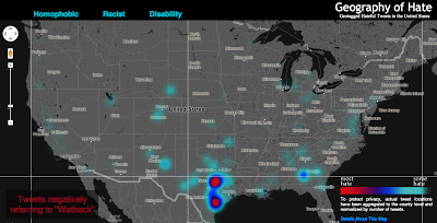
| Hotspots for “wetback” Tweets |
Perhaps the most interesting concentration comes for references to ‘wetback’, a slur meant to degrade Latino immigrants to the US by tying them to ‘illegal’ immigration. Ultimately, this term is used most in different areas of Texas, showing the state’s centrality to debates about immigration in the US. But the areas with significant concentrations aren’t necessarily that close to the border, and neither do other border states who feature prominently in debates about immigration contain significant concentrations.
Ultimately, some of the slurs included in our analysis might not have particularly revealing spatial distributions. But, unfortunately, they show the significant persistence of hatred in the United States and the ways that the open platforms of social media have been adopted and appropriated to allow for these ideas to be propagated.
Funding for this map was provided by the University Research and Creative Activities Fellowship at HSU. Geography students Amelia Egle, Miles Ross and Matthew Eiben at Humboldt State University coded tweets and created this map.
The full interactive map is available here:http://users.humboldt.edu/mstephens/hate/hate_map.html
Photo: Humboldt State University


